
CASE STUDIES
Check out these real life mobile website success stories
Consumers using mobile Web browsers are visiting your site -- whether you have pages designed for them or not. If they don't find what they want, their visits will be short before they go somewhere else. Click on the tabs below to read success stories.
Travel site cuts bounce rate 22% with mobile website
Summarized from “MarketingSherpa’s Top 5 Mobile Marketing Case Studies & How-tos”
© 2010-2011 MarketingSherpa LLC
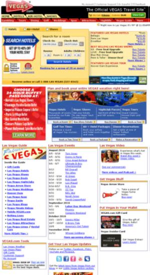
Vegas.com, a destination‐based travel and entertainment booking website, wanted to find out why mobile visitors to the site weren't staying very long.
According to company executives, "People [on mobile phones] who hit the site either were likely to abandon after viewing one page, or they got one or two pages in and said 'Gosh, this is too hard' and abandoned." The bounce rate of mobile visitors was about 50% higher than that of visitors to its desktop site. Their time spent and conversion rates were significantly lower, as well.

The Vegas.com team wanted to know whether a site tailored for mobile consumption would improve visitors’ experience, encourage them to stay longer on the site and increase sales.
The team built mobile versions of Vegas.com's homepage and specific category pages. They then ran a test that served mobile visitors either the mobile‐specific pages or the standard webpages and monitored the difference in performance metrics.
Specifically, the team created mobile versions of the homepage, category pages and its hotel room search tool. The homepage showed only the Vegas.com logo, phone number to call for booking, a display ad with special offer, and links to a dozen of the site’s most popular category pages, such as Hotel, Flight+Hotel and Shows and Nightlife (see samples left and right). The links were large enough to be easily read and clicked on a touchscreen. The page also avoided using too many images to ensure the site would have an efficient loading time.
The category pages included links to all relevant information. For example, the "Shows" page listed shows playing in town with links to more information. The "Hotel" page listed hotels in town, as well as a simple search tool to find available hotel rooms. Once visitors clicked beyond the category pages, they arrived on relevant webpages in the traditional website's format.
As the test proceeded, they detected which visitors to Vegas.com were using mobile devices and routed them to either the traditional page or the mobile test pages. Half of the mobile visitors were sent to the traditional homepage and the other half to the test page.
The test ran for just under two months. Compared to mobile traffic directed to the traditional site, traffic on the mobile test pages showed a 22% lower bounce rate and 16% more page views.
Executives consider the test results as proof that serving mobile visitors tailored pages increases results. Since then, the team has begun to customize pages deeper in the site that are used to book trips and buy tickets. They expect this second‐round of tests to boost conversion rates even more dramatically.
Consumers using mobile Web browsers are visiting your site – whether you have pages designed for them or not. If they don't find what they want, it won’t be long before they go somewhere else.
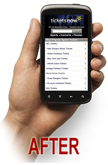
TicketsNow grows sales by 50% with a mobile redesign
Courtesy of Google's GoMo website
The Opportunity
A subsidiary of Ticketmaster, TicketsNow is a resale marketplace where fans buy and sell event tickets. When research revealed that more than 25% of ticketing-related web searches occur on mobile devices, they knew they needed to transform www.ticketsnow.com into a better experience for their mobile users.
Mobile Site Highlights
At first TicketsNow considered building a mobile app, but soon realized it that a mobile site was a better choice for them: it would work on all platforms and be easier to update. The new mobile site concentrates on making ticket and event information accessible and purchases a breeze. Simple, direct navigation helps users quickly find events that interest them and prominent search functionality makes it easy for customers who know exactly what they want to zero in. Ticket listings can be sorted by price, seat location and number available to further help filter results. Once a customer is ready to buy, a streamlined checkout process keeps purchases stress-free.
The Results
In the first month after TicketsNow launched the mobile site, average order values from mobile devices increased 8%, conversion rate grew by a sustained 50% and sales grew by 100%. The mobile site also increased return on ad spend by 30%.
Ryland Homes builds 300% increase in mobile registrations
Courtesy of Google's GoMo website
The Opportunity
Ryland Homes is one of America’s top five new-home builders. The company relies heavily on sales and marketing efforts to engage prospects early on in the decision-making process. With a steady increase in mobile traffic to www.ryland.com, the company needed to better support and engage its growing base of on-the-go prospects.
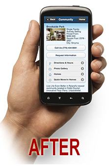
Mobile Site Highlights
Ryland’s mobile site launched in March 2011, and delivers information with minimal clicks. Consistent colors and button styles for each content type speed navigation, as does the site’s compact, vertical-scrolling design. Clickable phone numbers, location-based driving directions and fast online registration spark leads and conversions. Plus, mobile site redirects ensure that a user always sees the best version of the site for his or her device. “It just adapts to the device that the customer is viewing it on,” says Jason Grovert, Ryland Homes’ Chief Technology Officer. “It just works for them.”
The Results
Ryland has continued to improve on the site and is planning additional features: more floor plans, forward-to-a-friend functionality and info about events, promotions and awards. Mobile registrations are up 300% and mobile conversions cost about 30% less. Best of all, Ryland has now seen home sales that began as mobile leads.